
Problem Statement
- Kings of Wings is a fast-growing American BBQ restaurant brand offering a diverse range of products including wings, burgers, wraps, fries, desserts, beverages, BBQ buckets, takeaway meals, and family combos. However, the brand lacked a cohesive visual identity across its packaging and customer touchpoints.
- Different packaging formats did not communicate a consistent premium experience, making it difficult to create strong shelf presence, improve brand recall, and build customer loyalty in a highly competitive QSR market.
Scope of Work
Our engagement focused on building a complete packaging-led brand identity that delivers consistency, recognition, and a memorable customer experience.
Brand Identity
- Logo refinement and brand adaptation
- Color palette and typography selection
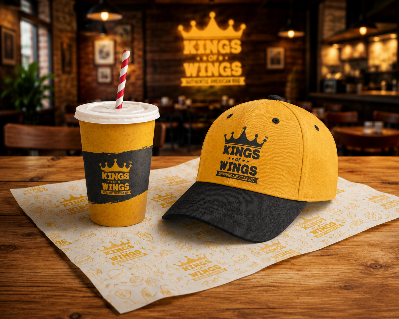
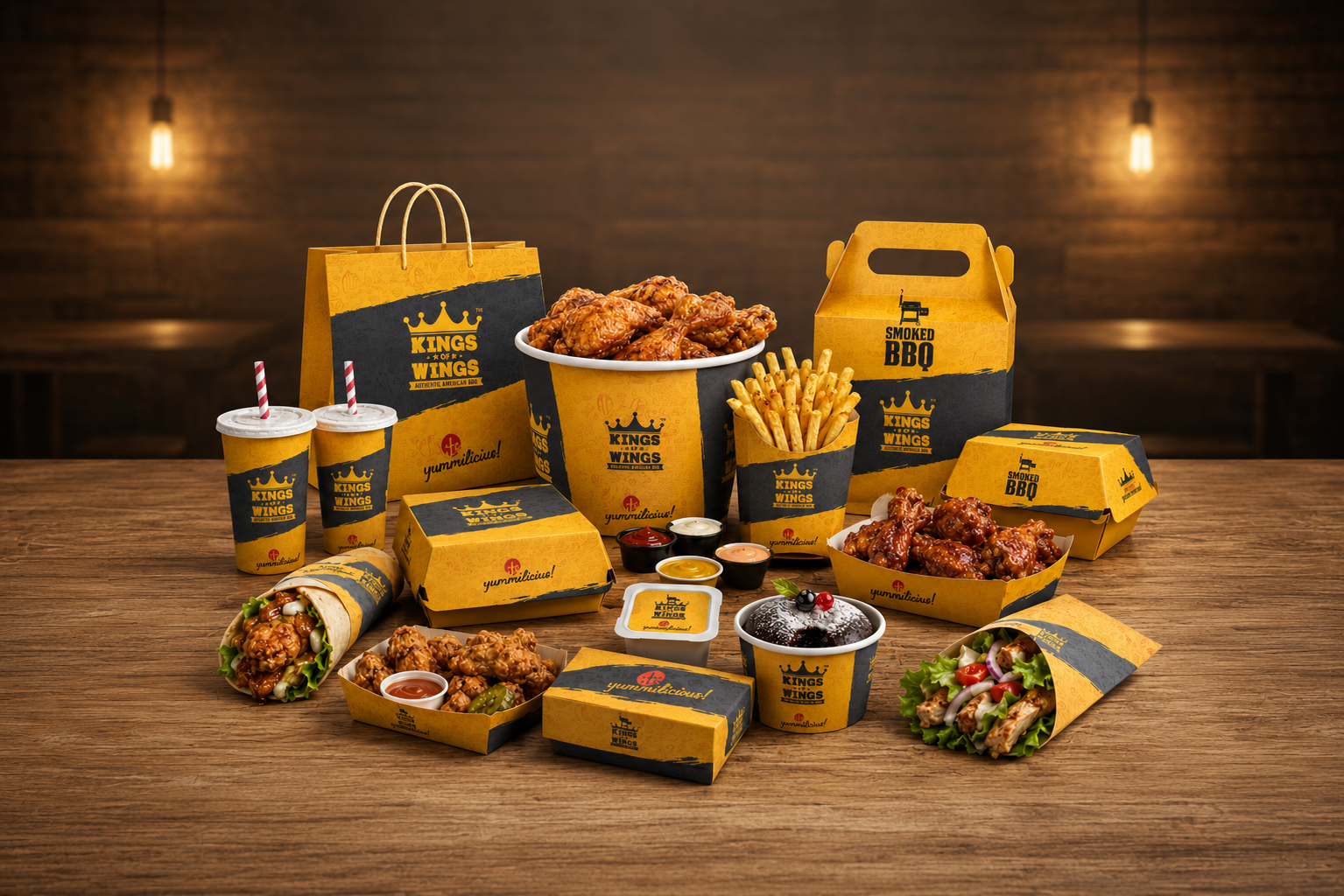
Packaging Design
- Burger boxes
- Wrap sleeves
- French fries cartons
- Chicken buckets
- Dessert tubs
- Beverage cups
- Carry bags
- Butter paper
- Sauce containers
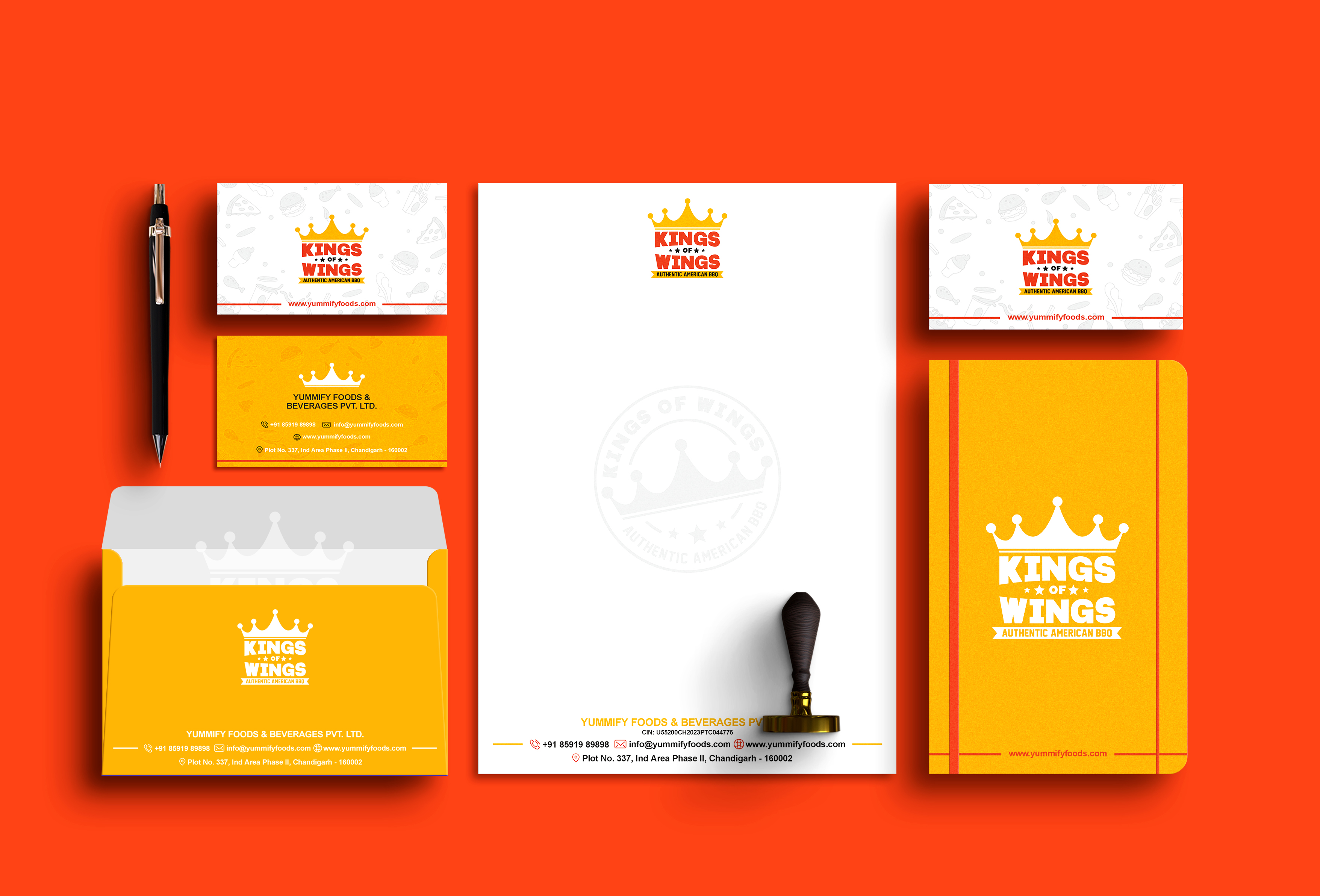
Brand Collateral
- Visiting cards
- Letterhead
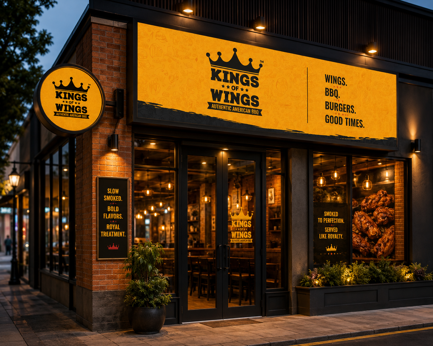
- Restaurant signage
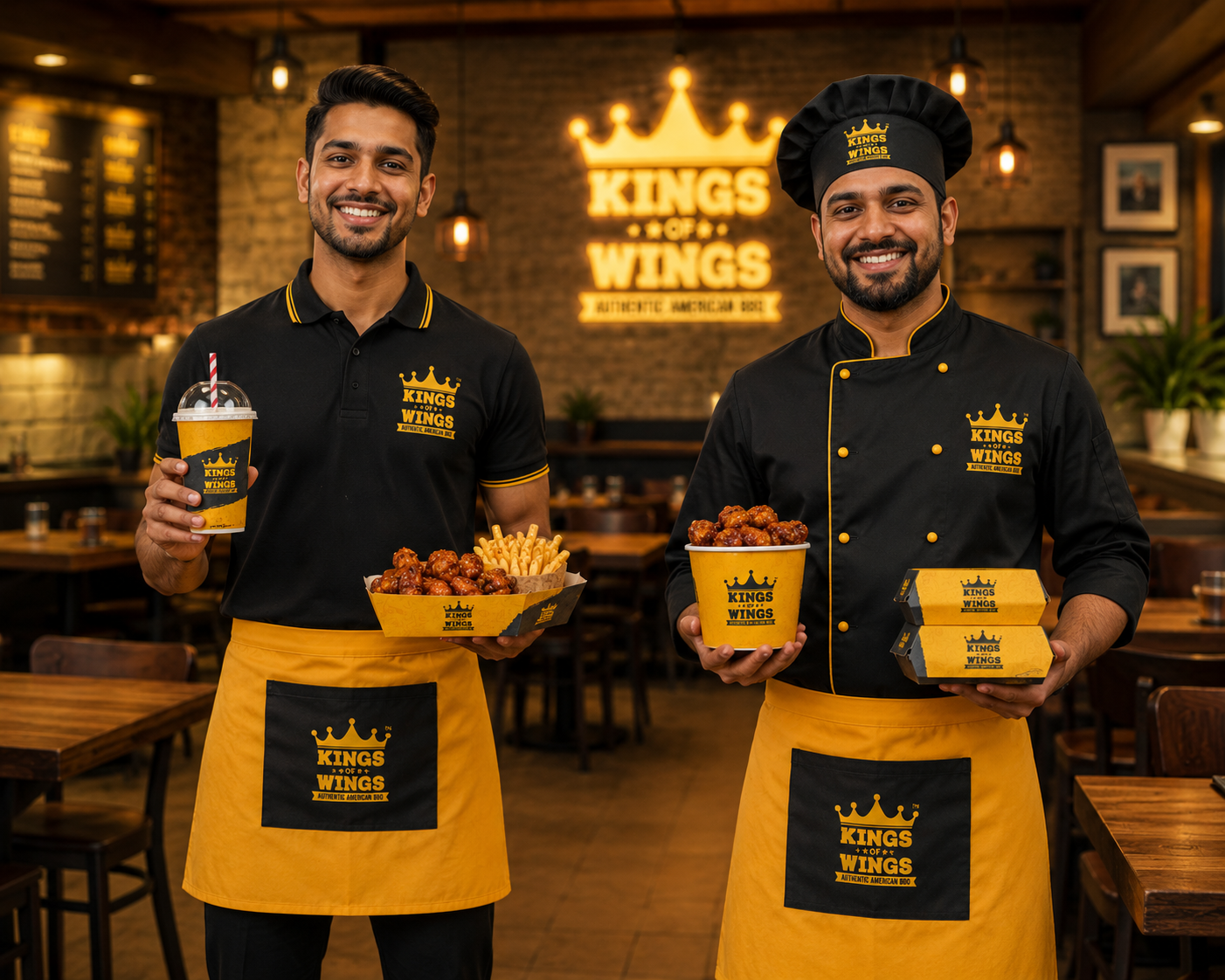
- Staff uniforms
- Restaurant Environment
The Solution
We developed a bold and energetic brand system inspired by authentic American BBQ culture, combining vibrant yellow, charcoal black, and rich food photography to create a memorable visual identity.
The packaging system was designed to work seamlessly across every product category while maintaining a consistent premium look and feel. Each touchpoint—from takeaway boxes and wraps to beverage cups and restaurant signage—reinforces the same brand personality, creating a unified customer experience both inside the restaurant and during delivery.
The result is a scalable brand ecosystem that:
- Creates instant recognition across all packaging.
- Enhances perceived product quality and premium value.
- Strengthens customer recall through consistent branding.
- Improves in-store and takeaway presentation.
- Supports future expansion with a flexible packaging system.
- Delivers a cohesive brand experience across physical and digital touchpoints.
This complete identity transforms Kings of Wings from simply a food outlet into a recognizable American BBQ brand with a strong, modern, and memorable market presence.
Testimonials
We recently connected with Purple Horn and Noel to initiate the re-branding exercise for my company. We first got our business card re-designed and soon followed it up by getting our brochures designed and eventually our annual calendars.
We wish team Purple and Noel all the very best for all their future endeavours.
Armed Fire Services
Anandan N
Share on